
Windows
Overview
Available since Glue42 Enterprise 3.10
The Workspaces API offers advanced window management functionalities. Workspaces allow you to arrange multiple apps within the same visual window (called Frame). This is performed either programmatically or by dragging and dropping floating windows in a Workspace, rearranging windows that are already in the Workspace or extracting windows from the Workspace. Each app is treated as an individual building block that can be added, removed, moved or resized within the unifying frame. Save easily Workspace Layouts and restore them within the same frame or even in different frames. When a Workspace Layout is restored, the arrangement of the apps participating in it and their context data is preserved - resume working right from where you left off.
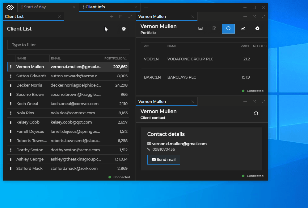
See below how the user builds, saves, restores and manipulates Workspaces:
Workspaces Concepts
Frame
The Frame is a web app (also called Workspaces App) which comes with Glue42 Enterprise. This app is the shell that can hold multiple Workspaces as tabs in a single or multiple windows (frames). The Frame app is a vital element in the Workspaces functionality as it handles opening and closing Workspaces, arranging windows in a Workspace, adding or removing Workspaces and windows.
You can also create your own custom Workspaces App. For more details, see the Extending Workspaces section below.
Workspace
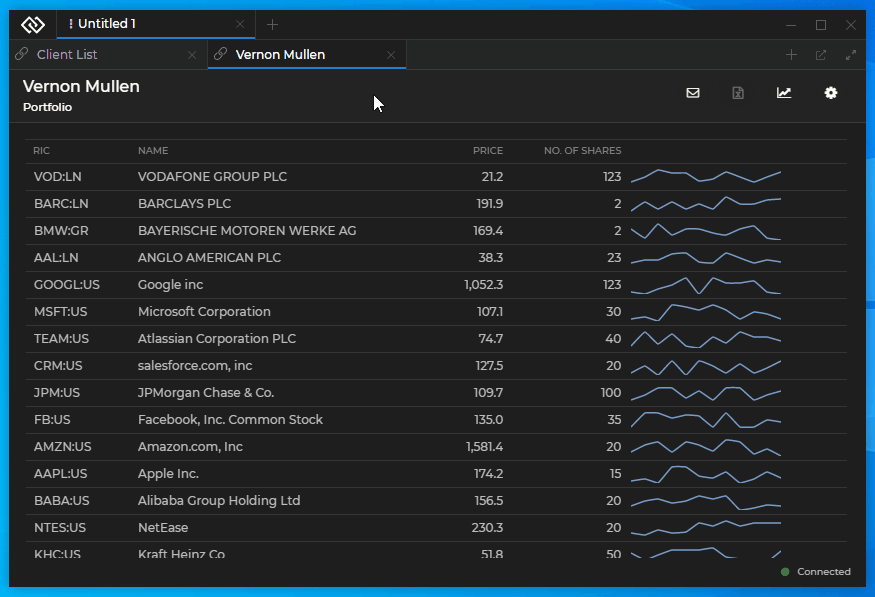
A Workspace contains one or more apps (windows) arranged in columns, rows or groups of tabbed windows. Each app acts as a building block of a Workspace and can be resized, maximized and restored within a Workspace. Apps can be added to a Workspace (by drag and drop or programmatically) and can also be ejected from a Workspace as floating windows. The arrangement of each Workspace can be uniquely suited to provide the necessary layout and functionalities for performing tasks quickly and intuitively. Instead of wasting time and effort in finding, opening and arranging the relevant apps, restore the respective Workspace with a single click.
Workspace Layout
A Workspace Layout is a JSON object which describes the model of a Workspace. It contains the name of the Workspace, the structure of its children and how they are arranged, the names of each app present in the Workspace, context and other settings. This Layout is the blueprint used by the API to build the Workspace and its components. Workspace Layouts can be defined both programmatically - when creating or restoring Workspaces at runtime, and through configuration - when defining default Workspaces to be loaded by the Workspaces App (see Extending Workspaces > Configuration).
The following example demonstrates a basic Layout definition of a Workspace containing two apps:
{
    "children": [
        {
            "type": "row",
            "children": [
                {
                    "type": "group",
                    "children": [
                        {
                            "type": "window",
                            "appName": "clientlist"
                        }
                    ]
                },
                {
                    "type": "group",
                    "children": [
                        {
                            "type": "window",
                            "appName": "clientportfolio"
                        }
                    ]
                }
            ]
        }
    ]
}
Using Workspaces
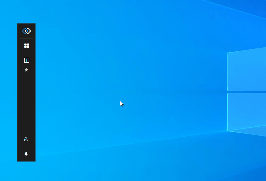
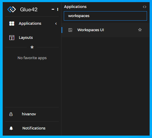
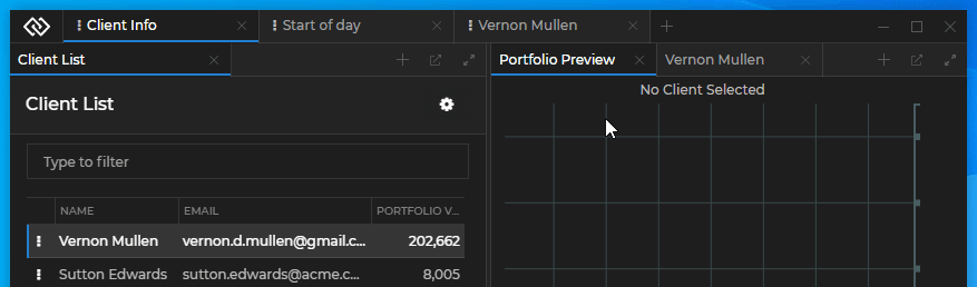
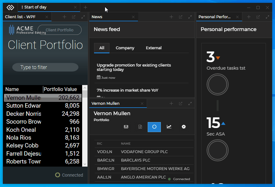
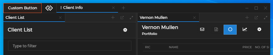
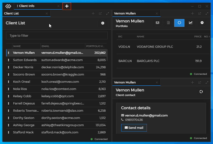
To begin creating and manipulating Workspaces, start the Workspaces UI from the Glue42 Toolbar:
Adding Apps
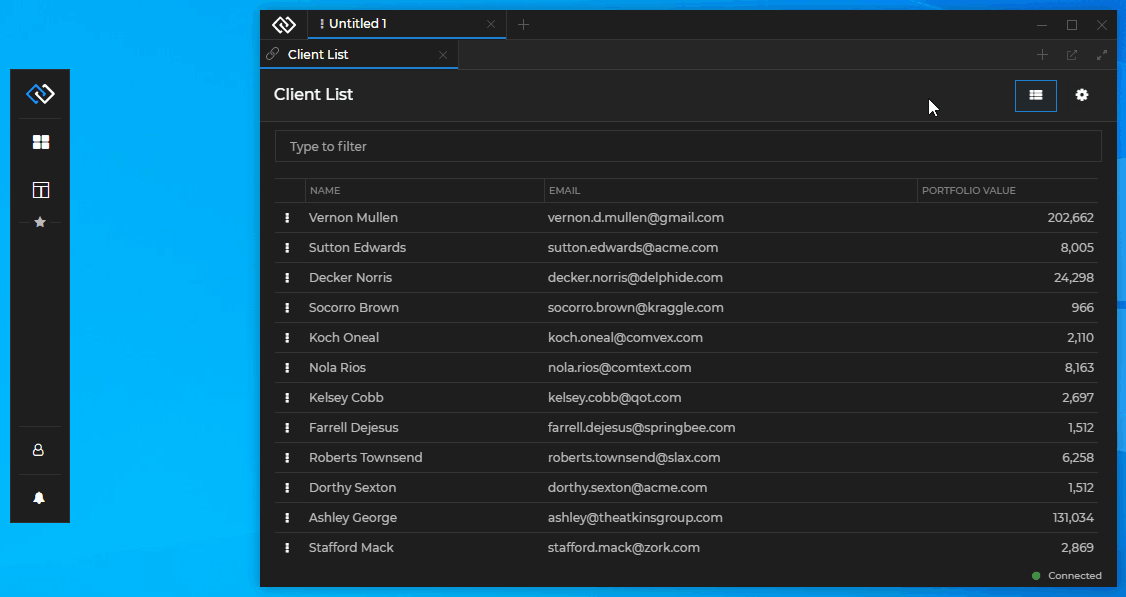
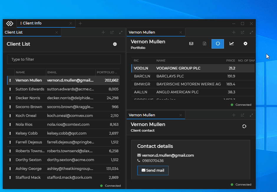
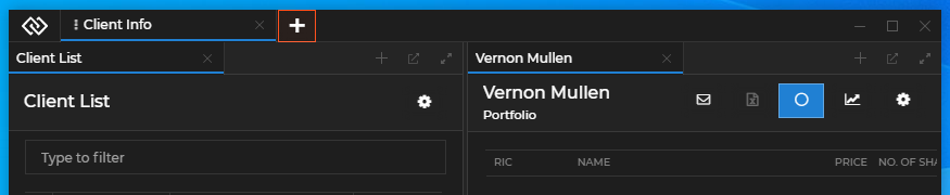
Add your first app by using the "+" button at the center of an empty Workspace or by dragging and dropping an app inside it:
Continue adding apps from the "+" button in the tab header of an already opened app or by dragging and dropping apps inside the Workspace:
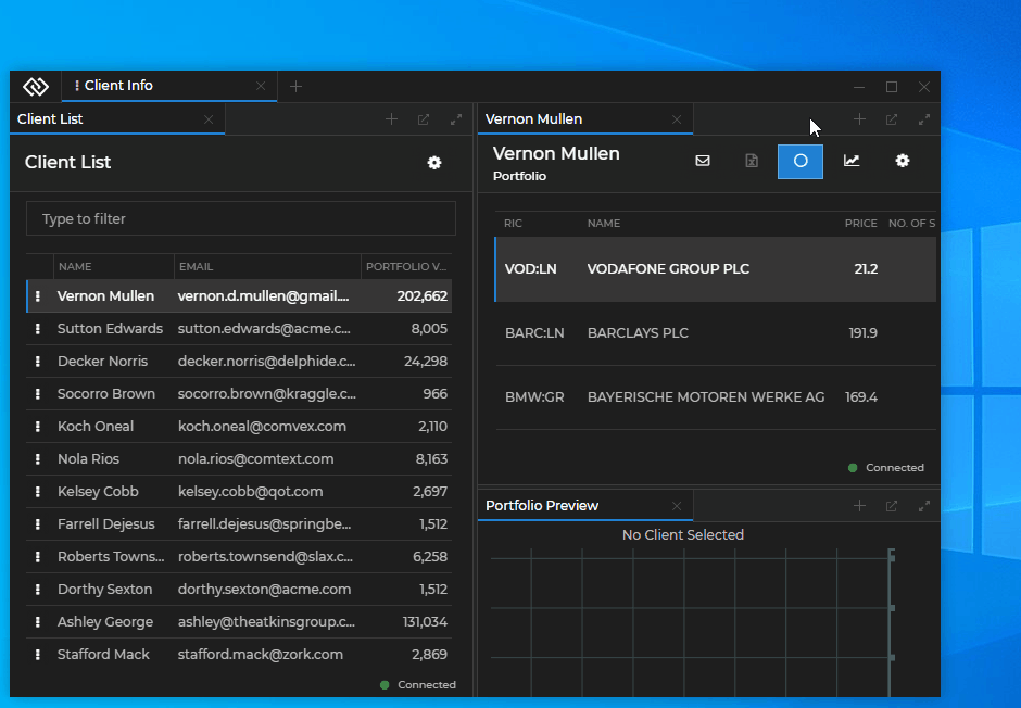
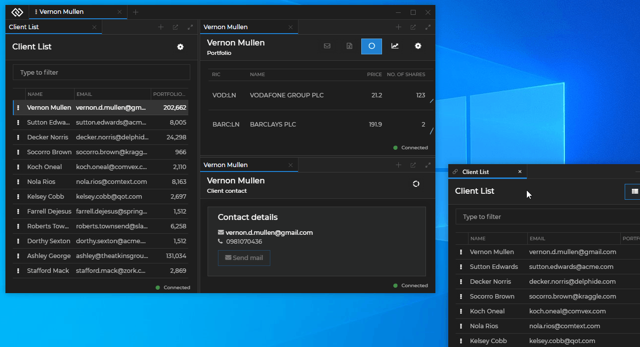
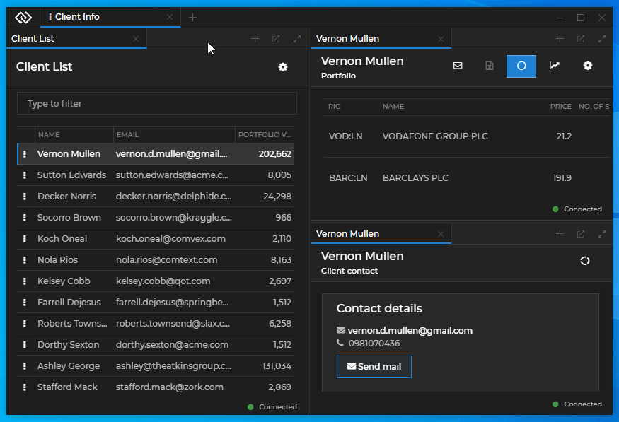
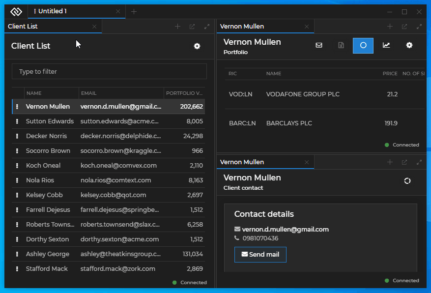
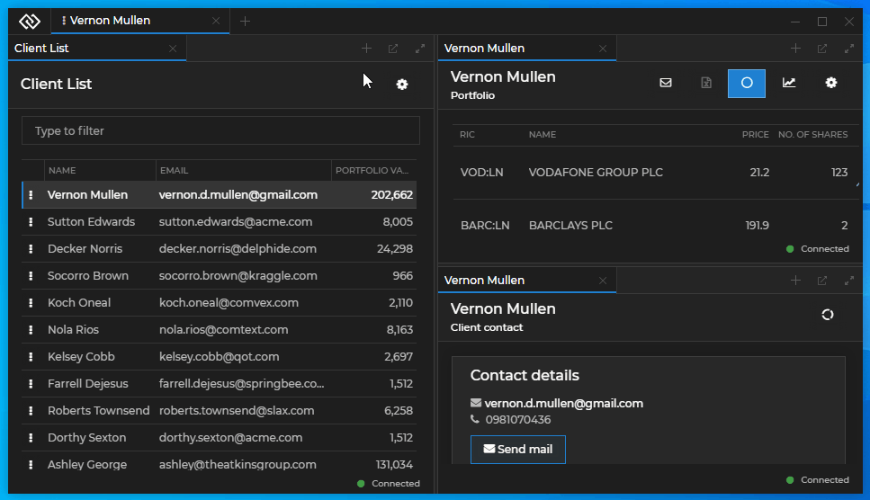
Extracting Workspaces & Apps
Extract or add entire Workspaces by dragging and dropping their tabs in the Workspace tab area:
Extract apps from a Workspace by dragging and dropping them outside the Workspace, or by using the "Eject" button in the window tab header:
Preventing App Drop
To prevent an app window from automatically dropping in a Workspace while dragging it over a Workspace and releasing it, hold ALT. This way, you can place the app window at any position on the screen, even if a Workspace is open behind it. The following demonstrates how when the user holds ALT the highlighted drop area in the Workspace disappears and the app window can be placed freely at the desired position without becoming part of the Workspace:
Arranging Workspaces
Arrange the apps in a Workspace by dragging and dropping them at the desired location. Hover over the Workspace while holding the app window to see where the window will be situated when you drop it. Place the window as a new column, row or as a new tab in a tab group. Resize the Workspace elements by dragging the borders between them:
Rearrange the order of Workspace tabs or the order of window tabs in a tab group by dragging and dropping the tabs at the desired position:
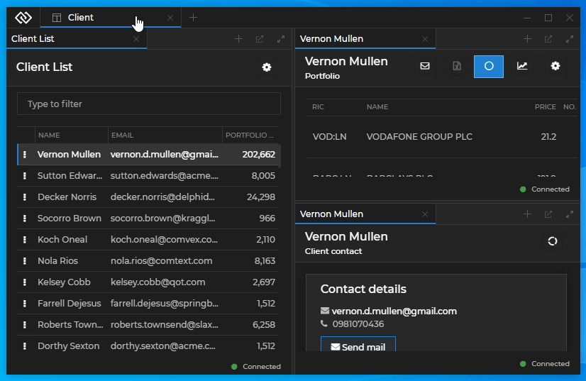
Maximize and restore an app window within a Workspace with the "Maximize/Restore" button in the window tab header:
Creating, Saving and Restoring
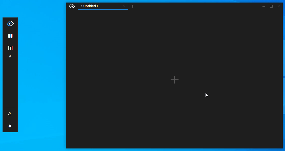
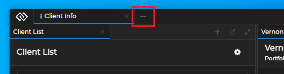
To create a new empty Workspace, use the "+" button in the Workspaces UI tab header and click "Create New":
To save a Workspace Layout, use the "Save" button on the Workspace tab:
To restore a Workspace Layout, use the "+" button on the Workspace tab and select a previously saved Workspace from the menu:
Locking Workspaces
Available since Glue42 Enterprise 3.17
Using the "Lock Settings" section of the menu available on each Workspace tab, you can manually suspend various Workspace functionalities or hide different Workspace buttons in order to prevent the Workspace from being modified. The following demonstrates how to hide the Workspace tab "Close" button and all "Eject" buttons of the Workspace windows:
When one or more features of a Workspace have been locked, a "Lock" icon appears on the Workspace tab.
The following table describes all available Workspace lock settings:
| Setting | Description |
|---|---|
| Lock All | Locks all Workspace functionalities preventing the user from modifying the Workspace or the windows participating in it. |
| Disable Drop | Will prevent the user from adding windows by dropping them in the Workspace. |
| Disable Drop Bottom | Will prevent the user from dropping windows in the bottommost area of the Workspace. |
| Disable Drop Left | Will prevent the user from dropping windows in the leftmost area of the Workspace. |
| Disable Drop Right | Will prevent the user from dropping windows in the rightmost area of the Workspace. |
| Disable Drop Top | Will prevent the user from dropping windows in the topmost area of the Workspace. |
| Disable Extract | Will prevent the user from extracting and rearranging windows inside the Workspace. |
| Disable Splitters | Will prevent the splitters from being draggable, so the Workspace elements can't be resized. |
| Disable Window Reorder | Will prevent the user from reordering windows in the Workspace. |
| Disable Workspace Tab Extract | Will prevent the user from extracting the Workspace tab from the Workspaces App. |
| Disable Workspace Tab Reorder | Will prevent the user from reordering the Workspace tab in the Workspaces App. |
| Hide Add Window | Will hide all "Add Window" buttons (the "+" buttons) in the headers of window groups. |
| Hide Close | Will hide the "Close" button on the Workspace tab. |
| Hide Eject | Will hide all "Eject" buttons in the headers of window groups. |
| Hide Save | Will hide the "Save Workspace" button on the Workspace tab. |
| Hide Window Close | Will hide all "Close" buttons on the window tabs. |
Extending Workspaces
Available since Glue42 Enterprise 3.11
The @glue42/workspaces-ui-react library provides all functionalities necessary for building a Workspaces App as a single React component - <Workspaces />. The <Workspaces /> component provides extensibility points for passing custom components to it and can also be wrapped in other components (see Workspaces Component). The library enables you to use custom system popups, create your own popups from HTML elements (see Custom Popups) and compose the content of a Workspace (see Composing Workspace Content). The @glue42/workspaces-ui-react library also provides mechanisms ensuring the correct usage of the Workspaces API in a Workspaces App (see Using Glue42 APIs in the Frame).
Hot module reloading is supported, but keep in mind that each refresh closes all apps and Workspaces in the Frame.
To open a console window for the Workspaces App when testing or debugging, press SHIFT + F12.
Note that the @glue42/workspaces-ui-react library doesn't include a built Workspaces App. A Workspaces App is provided in Glue42 Enterprise. You can also use and customize the Workspaces App template.
If your Workspaces App is meant for a Glue42 Core project, skip the Configuration and the Limitations sections, as well as the instructions for ensuring Windows 7 support, as they are relevant only for Glue42 Enterprise projects.
Configuration
Your custom Workspaces App, as every Glue42 enabled app, must have an app configuration file. Glue42 Enterprise comes with a Workspaces UI app and a configuration file for it named workspaces.json and located in %LocalAppData%\Tick42\GlueDesktop\config\apps. Modify or replace this file with your own configuration file, or delete it, if your app configurations are stored at another location.
The "type" property must be set to "workspaces":
{
    "title": "Workspaces UI",
    "type": "workspaces",
    "name": "workspaces-demo",
    "icon": "http://localhost:22080/resources/icons/workspaces.ico",
    "details": {
        "layouts": [],
        "url": "http://localhost:3000",
        "updateFrameConstraints": false,
        "framePool": 4
    },
    "customProperties": {}
}
The "url" and "layouts" properties are optional. Use "url" to specify where the app is hosted, otherwise it will default to the Workspaces App template distributed with Glue42 Enterprise.
Use the "layouts" property to define Workspace Layouts that will be loaded on startup of the Workspaces App.
If an already existing Workspace Layout has been saved under a specific name, instead of the standard Workspace Layouts object, you can also use a simpler object to restore it:
{
    "layoutName": "My Workspaces"
}
The "updateFrameConstraints" property by default is set to true, which means that the Frame is restricted to the constraints of the Workspace and its elements inside it. Set to false if you don't want to prevent the user from resizing your custom Workspaces App beyond the constraints of its content.
The "framePool" property can be used to specify how many semi-initialized Frames (3 by default) will be cached in order to provide a smoother experience when dragging out a Workspace from an existing Frame. The higher the number, the higher the memory consumption; the lower the number, the higher the risk of rejection due to an empty pool when dragging out a Workspace.
Empty Frames & Workspaces
To open an empty Frame with a constant loading animation and no Workspaces in it, set the "layouts" property to an empty array:
{
    "details": {
        "layouts": []
    }
}
To start the Workspaces App with an empty untitled Workspace in it, either skip the "layouts" property, or pass an object with a "children" property set to an empty array:
{
    "details": {
        "layouts": [{ "children": [] }]
    }
}
Context
Use the "config" property of the standard Workspace Layout object or the "restoreConfig" property of the simpler object to pass context to the Workspace:
// Standard Workspace Layout definition.
{
    "children": [],
    "config": {
        "context": { "glue" : 42 }
    }
},

// Or a simpler Workspace Layout definition for an already existing Layout.
{
    "layoutName": "My Workspace",
    "restoreConfig": {
        "context": { "glue" : 42 }
    }
}
For more details on how to use Workspace context programmatically, see the Workspace Context section.
Tab Header
Hiding the Workspace tab header prevents the user from manipulating the Workspace through the UI and allows for the Workspace to be controlled entirely through API calls. For instance, a Workspace may be tied programmatically to certain logic designed to manage its state without any user interaction.
Use the "config" property of the standard Workspace Layout object or the "restoreConfig" property of the simpler object to hide and show its tab header:
// Standard Workspace Layout definition.
{
    "children": [],
    "config": {
        "noTabHeader": true
    }
},

// Or a simpler Workspace Layout definition for an already existing Layout.
{
    "layoutName": "My Workspace",
    "restoreConfig": {
        "noTabHeader": true
    }
}
For more details on how to pass configuration when creating and restoring Workspaces, see the Workspace > Creating Workspaces and Workspace > Restoring Workspaces sections.
Pinning & Unpinning
Available since Glue42 Enterprise 3.14
Pinned Workspaces tabs are placed before the regular Workspace tabs and are represented only by their icon - they don't have a title, nor "Close" or "Save Workspace" buttons, so that they can't be closed and their initial Layout can't be overwritten by the end user.
Use the "config" property of the standard Workspace Layout object or the "restoreConfig" property of the simpler object to pin or unpin a Workspace and provide an icon to be used when pinned:
// Standard Workspace Layout definition.
{
    "children": [],
    "config": {
        "icon": "base64-icon",
        "isPinned": true
    }
},

// Or a simpler Workspace Layout definition for an already existing Layout.
{
    "layoutName": "My Workspace",
    "restoreConfig": {
        "icon": "base64-icon",
        "isPinned": true
    }
}
For more details on pinning and unpinning Workspaces programmatically, see the Workspace > Pinning & Unpinning Workspaces section.
Lock Settings
Available since Glue42 Enterprise 3.12
Use the "config" property of the standard Workspace Layout object to provide lock settings for the Workspace in order to prevent the user from modifying it. You can also specify lock settings for individual Workspace Box Elements and Workspace windows by using the "config" property of the respective Box or Workspace window definition object.
The following example demonstrates how to disable dropping apps in the leftmost area of the Workspace, hide the Workspace tab "Close" button, and prevent the user from extracting Workspace windows from one of the Workspace Group elements:
{
    "children": [
        {
            "type": "group",
            "children": [
                {
                    "type": "window",
                    "appName": "clientlist"
                }
            ],
            "config": {
                "allowExtract": false
            }
        },
        {
            "type": "group",
            "children": [
                {
                    "type": "window",
                    "appName": "clientportfolio"
                }
            ]
        }
    ],
    "config": {
        "allowDropLeft": false,
        "showCloseButton": false
    }
}
For more details on how to lock Workspaces programmatically and on all available lock settings for Workspaces and their elements, see the Workspace > Lock Settings section. For details on using the Lock Settings UI in the Workspaces App, see the Using Workspaces > Locking Workspaces section.
Excluding & Including Apps in Workspaces
To control whether an app will be available in the Workspace "Add Application" menu (the dropdown that appears when you click the "+" button to add an app), use the "includeInWorkspaces" property of the "customProperties" top-level key in your app configuration:
{
    "customProperties": {
        "includeInWorkspaces": true
    }
}
By default, this property is set to false, which means that by default apps aren't visible in the "Add Application" dropdown menu of the Workspaces App.
Available since Glue42 Enterprise 3.17
To prevent an app from participating in Workspaces, set the "allowWorkspaceDrop" top-level key in the app configuration to false:
{
    "allowWorkspaceDrop": false
}
By default, this property is set to true, which means that by default users are able to drag and drop apps in a Workspace.
Workspace Tab Extract
Available since Glue42 Enterprise 3.17
To prevent users from extracting Workspace tabs from the Workspaces App, set the "allowWorkspaceTabExtract" property of the "details" top-level key to false in the Workspaces App definition:
{
    "details": {
        "allowWorkspaceTabExtract": false
    }
}
See also how to set this property programmatically using the Workspace Lock Settings.
Hibernation
Available since Glue42 Enterprise 3.12
Workspaces can be configured to use hibernation in order to free up system resources. Apps in hibernated Workspaces are closed and when the user activates the Workspace, they are loaded again in the same configuration. This allows for a more flexible system resource usage, as a single Workspace may contain many apps and the user may be working simultaneously with several Workspaces, not taking into account other apps that may already be heavily consuming system resources.
By default, hibernation is disabled. To enable and configure hibernating Workspaces, use the "hibernation" property of the "details" key in the Workspaces App configuration file. There are three rules available which you can set in order to define when a Workspace should be hibernated. The rules set limits in regard to the available system memory, the Workspace idle time and the maximum number of active Workspaces:
{
    "details": {
        "hibernation": {
            "enabled": true,
            "interval": 10,
            "workspacesToClose": 2,
            "rules": [
                {
                    "enabled": true,
                    "type": "InsufficientSystemMemory",
                    // In MBs.
                    "threshold": 1024
                },
                {
                    "enabled": true,
                    "type": "WorkspaceIdleTime",
                    // In minutes.
                    "threshold": 10
                },
                {
                    "enabled": true,
                    "type": "MaximumActiveWorkspaces",
                    "threshold": 3
                }
            ]
        }
    }
}
The "hibernation" key has the following properties:
| Property | Type | Description | Default |
|---|---|---|---|
"enabled" |
boolean |
Set to true to enable Workspaces hibernation. |
false |
"interval" |
number |
Interval in minutes at which to check whether any Workspaces should be hibernated. | 120 |
"workspacesToClose" |
number |
Number of Workspaces to hibernate at a time. The higher the number, the more the usage of system resources will spike. | 1 |
"rules" |
object[] |
Rules that will define whether a Workspace should be hibernated. | - |
Each hibernation rule is an object with three properties - "enabled", "type" and "threshold". Set "enabled" to true to activate the rule. The "type" property accepts the name of the rule and "threshold" - the value for the rule. Available hibernation rules:
| Rule | Description | Default |
|---|---|---|
"InsufficientSystemMemory" |
If the available system memory falls below the limit set by this rule, Workspaces will be hibernated. | 2048 |
"WorkspaceIdleTime" |
If a Workspace has been idle for the amount of time set by this rule, it will be hibernated. | 120 |
"MaximumActiveWorkspaces" |
If the maximum number of active Workspaces set by this rule has been reached, Workspace hibernation will begin. | 5 |
For programmatic control of Workspace hibernation, see the Hibernation section.
Loading Strategies
Available since Glue42 Enterprise 3.12
Apps in Workspaces can be loaded using different strategies depending on whether everything should be loaded simultaneously from the very beginning, or the visible apps should be loaded first. If the visible apps are loaded first, you can specify whether the invisible ones (hidden behind another app as a tab) should load only when the user activates them, or should start loading in the background at set intervals.
The available loading strategies are "direct", "delayed" and "lazy". In "direct" mode, all apps are loaded on startup. In "delayed" mode, the visible apps are loaded first and then the invisible apps are loaded in batches at set intervals until all apps are eventually loaded. In "lazy" mode, the visible apps are loaded first and then invisible apps are loaded only on demand when the user activates them. This way some apps may never load if the user doesn't need them. Each strategy for loading apps in a Workspace has different advantages and disadvantages. It's important to take into consideration the actual user needs, as well as the available machine resources, before deciding on a specific strategy.
Advantages and disadvantages of the different loading strategies:
| Mode | Advantages | Disadvantages |
|---|---|---|
"direct" |
The user gets everything up and running from the very beginning. | The CPU usage will spike when opening the Workspaces, because all apps start loading at the same time. May lead to poor user experience. High memory consumption - all apps are loaded and take up memory, even if they remain unused. |
"delayed" |
The loading time of visible apps is decreased due to reduced CPU load at startup, because invisible apps aren't loaded initially. | High memory consumption - delayed loading, but still all apps are loaded and take up memory, even if they remain unused. |
"lazy" |
The loading time of visible apps is decreased due to reduced CPU load on startup, because invisible apps aren't loaded initially. Some apps might not be loaded at all if the user doesn't need them. Eventually, this leads to reduced memory usage. | Apps which aren't loaded initially are loaded only when the user activates them. This may be inconvenient if loading the app takes too long. |
To configure the loading strategies for Workspaces, use the "loading" property to the "details" key in the Workspaces App configuration file. The following example demonstrates how to use "delayed" as a default strategy. The invisible apps will start loading in batches of 2 after an initial interval of 2 seconds and then every 3 seconds a new batch will start loading until all apps in the Workspace have been loaded:
{
    "details": {
        "loading": {
            "loadingStrategy": "delayed",
            "initialOffsetInterval": 2000,
            "interval": 3000,
            "batch": 2,
            // This indicator should only be used in development.
            "showDelayedIndicator": true
        }
    }
}
The "loading" key has the following properties:
| Property | Type | Description | Default |
|---|---|---|---|
"loadingStrategy" |
string |
Determines the default loading strategy. Can be "direct", "delayed" or "lazy". |
"direct" |
"initialOffsetInterval" |
number |
Initial period in milliseconds after which to start loading apps in batches. Valid only in "delayed" mode. |
1000 |
"interval" |
number |
Interval in milliseconds at which to load the app batches. Valid only in "delayed" mode. |
5000 |
"batch" |
number |
Number of apps in a batch to be loaded at each interval. Valid only in "delayed" mode. |
1 |
"showDelayedIndicator" |
boolean |
Whether to show a Zzz indicator on the tabs of the apps that haven't been loaded yet. Useful in development for testing purposes, but shouldn't be delivered to end users. |
false |
For programmatic control of Workspace loading strategies, see the Loading Strategies section.
Multiple Workspaces Apps
Available since Glue42 Enterprise 3.16
It's possible to use more than one version of the Workspaces App when your various business use-cases demand different Workspaces App designs or functionalities.
Each Workspaces App that you want to use must have a separate configuration file with its "type" property set to "workspaces". You can use the "default" property of the "details" top-level key to specify a default Workspaces app that will handle all Workspaces whose Layouts don't contain information about which Workspaces App to target (or when the targeted Workspaces App is missing) when creating or restoring them.
The following example shows sample configurations for two different Workspaces Apps, the first of which will be the default one:
[
    {
        "title": "Workspaces One",
        "type": "workspaces",
        "name": "workspaces-one",
        "details": {
            "default": true,
            "layouts": [],
            "url": "http://localhost:3000"
        },
        "customProperties": {}
    },
    {
        "title": "Workspaces Two",
        "type": "workspaces",
        "name": "workspaces-two",
        "details": {
            "layouts": [],
            "url": "http://localhost:3001"
        },
        "customProperties": {}
    }
]
Workspaces created by or opened and saved in a specified Workspaces App will be restored by the same Workspaces App. When saving and restoring a Global Layout, all Workspaces participating in it will be saved and restored in their respective Workspaces Apps.
For details on how to target different Workspaces Apps programmatically when creating or restoring Workspaces, see the Workspace > Targeting section.
Using Glue42 APIs in the Frame
The Workspaces App is a fully-featured Glue42 client, so you can use all Glue42 APIs in it.
However, there are some peculiarities regarding the Workspaces API. The Frame object is initially part of a pool of Frames that aren't fully initialized - a strategy that ensures dragging out a Workspace will be carried out as smooth as possible. Therefore it is possible for your code to be executed before the Frame has been loaded as a member of the API. To avoid this situation, you must use the methods provided by the @glue42/workspaces-ui-react library for handling this case.
For details on how to specify the number of Frames in the pool, see the Configuration section.
Getting the Frame Object
The getMyFrame() and glue.windows.my() methods by design don't work when used in a Frame. To get the Frame object, you must first use the getFrameId() function provided by the @glue42/workspaces-ui-react library which will return the ID of the current Frame. After that, to ensure that the window has been loaded as a Frame, you must use the Workspaces API waitForFrame() method which will resolve only after the window is out of the pool. This may never happen if the user never drags a Workspace out, so you shouldn't use timeouts.
The following example demonstrates how to correctly get the Frame object:
import React from "react";
import Workspaces, { getFrameId } from "@glue42/workspaces-ui-react";
import { useGlue } from "@glue42/react-hooks";

const App = () => {
    useGlue(async (glue) => {
        // Getting the ID of the current Frame.
        const frameID = getFrameId();
        // Waiting for the Frame to be loaded.
        const myFrame = await glue.workspaces.waitForFrame(frameID);

        // The Frame is now initialized and part of the API.
    }, []);

    return (
        <Workspaces />
    );
};

export default App;
It's recommended that all Glue42 and app logic be executed after the Frame has been loaded in order to avoid unexpected behaviors and memory leaks.
Header Elements
The Header Element of the Workspaces App isn't available as a single customizable component, but contains several customizable elements:
- Logo element;
- Add Workspace element;
- System Buttons element;
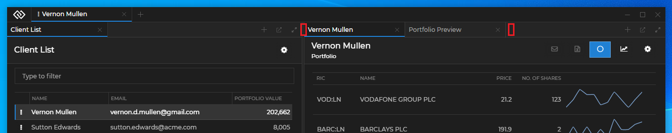
Note that the Move Area element, located between the Add Workspace and the System Buttons elements, can't be used to add custom components in it, but can be relocated by using the <MoveArea /> component (see Move Area Component).
The Logo element is located at the leftmost part of the Workspaces App header, to the left of the Workspace tabs, and hosts the <GlueLogo /> component. By default, it renders the Glue42 logo:
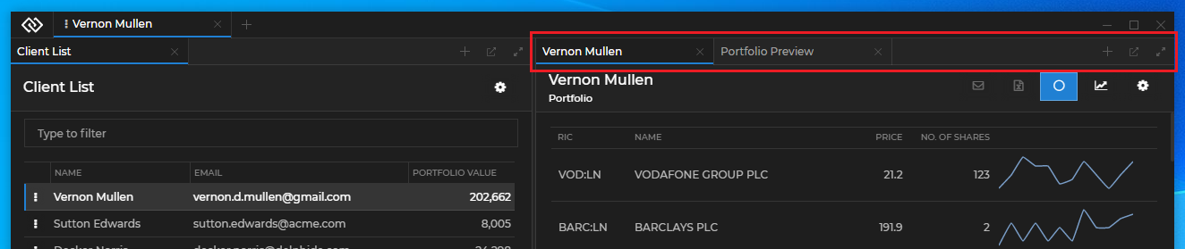
The Add Workspace element is located between the Workspace tabs and the move area and hosts the <AddWorkspaceButton /> component. By default, it renders the "+" button that opens the Add Workspace popup:
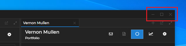
The System Buttons element is located at the rightmost part of the Workspaces App header, after the move area, and hosts the <MinimizeFrameButton />, <MaximizeFrameButton /> and <CloseFrameButton /> components. By default, they render the "Minimize", "Maximize" and "Close" buttons:
The following demonstrates the default structure of the Header element:
<>
    <GlueLogo />
    <>
        <WorkspaceTab />
    </>
    <AddWorkspaceButton />
    <MoveArea />
    <>
        <MinimizeFrameButton />
        <MaximizeFrameButton />
        <CloseFrameButton />
    </>
</>
Group Header Elements
The Group Header element contains the header of a tab window group within a Workspace:
The Group Header element isn't available as a single customizable component, but contains several customizable elements and zones. One or more Workspace Window Tab elements hold the individual tabs and the Group Header Buttons element holds the standard buttons for a window group in a Workspace ("Add Window", "Eject", "Maximize", "Restore"). There are two additional customizable zones that are located before and after the tabs:
Each Workspace Window Tab element hosts an individual <WorkspaceWindowTab /> component. Each <WorkspaceWindowTab /> component contains the <WorkspaceWindowChannelsLink />, <WorkspaceWindowTabTitle /> and <WorkspaceWindowTabCloseButton /> components. The Group Header Buttons element hosts the <GroupHeaderButtons /> component. The following demonstrates the default structure of the <WorkspaceWindowTab /> and the <GroupHeaderButtons /> components:
<WorkspaceWindowTab>
    <WorkspaceWindowChannelsLink />
    <WorkspaceWindowTabTitle />
    <WorkspaceWindowTabCloseButton />
</WorkspaceWindowTab>

<GroupHeaderButtons>
    <AddWindowButton />
    <EjectButton />
    <RestoreGroupButton />
    <MaximizeGroupButton />
</GroupHeaderButtons>
Using the Components
All default components can be reused and composed with custom code. If usage of such component has been detected, its default behavior will be applied. For instance, if you use the <AddWorkspaceButton /> component, a popup will automatically appear when the button is clicked, without the need of custom code to induce this behavior. If you pass the same component more than once, an error will be thrown.
To remove a component and make the respective element empty, pass a <Fragment /> component.
There are several prerequisites when creating a custom Workspaces App:
- The
<Workspaces />component accepts the size of its container. If it is nested in another component, the parent component must have itsheightstyle property set to100%in order for the<Workspaces />component to be visible. - The
@glue42/workspaces-ui-reactlibrary depends on theglueobject returned by the initialized Glue42 JavaScript library. If you have used the Glue42 React Hooks wrapper to obtain theglueobject, or if you have attached theglueobject to the globalwindowobject, it will be automatically passed to the<Workspaces />component as a prop. Otherwise, you must pass it manually. - The CSS files must be added manually (see Styles).
Workspaces Component
The <Workspaces /> component has two props - glue and components. The glue prop expects the glue object returned by the initialized Glue42 library. The components prop is used to define the header components (see Header Components), the system popup components or apps (see Replacing the System Popups), the Workspace content to be rendered (see Composing Workspace Content) and the loading animation to be used when loading a Workspace (see Loading Animation).
It is important to note that the <Workspaces> component isn't meant to be used as a typical React component. Besides its rendering responsibilities, it also contains heavy logic. This component is meant to allow you to create a dedicated Workspaces App which must function as a standalone window - you must never use it as part of another app, as this will lead to malfunctioning. The Workspaces App should be customized only using the available extensibility points.
The following example demonstrates the structure of the <Workspaces /> component, its properties and default values:
<Workspaces
components={{
header: {
LogoComponent: GlueLogo,
WorkspaceTabComponent: () => {
return (
<>
<WorkspaceIconButton />
<WorkspaceSaveButton />
<WorkspaceTitle />
<WorkspaceTabCloseButton />
</>
);
},
AddWorkspaceComponent: AddWorkspaceButton,
SystemButtonsComponent: () => {
return (
<>
<MinimizeFrameButton />
<MaximizeFrameButton />
<CloseFrameButton />
</>
);
}
},
groupHeader: {
WorkspaceWindowTabComponent: () => {
return (
<>
<WorkspaceWindowChannelsLink />
<WorkspaceWindowTabTitle />
<WorkspaceWindowTabCloseButton />
</>
);
},
ButtonsComponent: () => {
return (
<>
<AddWindowButton />
<EjectButton />
<RestoreGroupButton />
<MaximizeGroupButton />
</>
);
},
BeforeTabsComponent: () => <></>,
AfterTabsComponent: () => <></>
},
popups: {
SaveWorkspaceComponent: SaveWorkspacePopup,
AddApplicationComponent: AddApplicationPopup,
AddWorkspaceComponent: AddWorkspacePopup
},
loadingAnimation: {
Workspace: WorkspaceLoadingAnimation
},
WorkspaceContents: WorkspaceContents
}}
glue={glue}
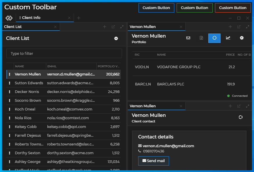
/>Wrapping the Workspaces App in a single React component allows you to place custom components around it. The following example demonstrates how easy it is to customize the Workspaces App with your own toolbar:
import React from "react";
import Workspaces from "@glue42/workspaces-ui-react";
import MyCustomToolbar from "./MyCustomToolbar";
const App = () => {
return (
<div className="App">
<MyCustomToolbar />
<Workspaces />
</div>
);
};
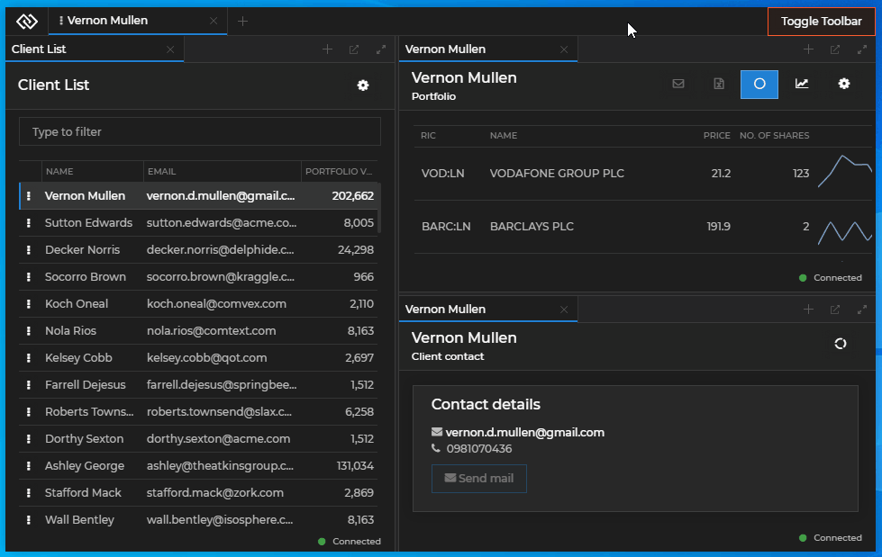
export default App;Adding a custom toolbar with buttons to the Workspaces App:
Header Components
Use the default components for the header of the Workspaces App, or replace them with your custom ones. Compose more than one component in a header element by passing a function that returns a <Fragment /> component.
Logo
The following example demonstrates composing the Glue42 logo and a custom button in the Logo element:
import React from "react";
import Workspaces, { GlueLogo } from "@glue42/workspaces-ui-react";
import CustomButton from "./CustomButton";

const App = () => {
    return (
        <div className="App">
            <Workspaces
                components={{
                    header: {
                        LogoComponent: () => <> <CustomButton /> <GlueLogo /> </>
                    }
                }}
            />
        </div>
    );
};

export default App;
Adding a custom button in the Logo element:
Add Workspace
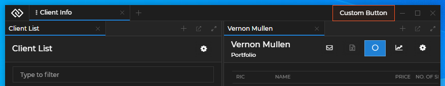
The following example demonstrates replacing the default Add Workspace component with a custom button:
import React from "react";
import Workspaces from "@glue42/workspaces-ui-react";
import CustomButton from "./CustomButton";

const App = () => {
    return (
        <div className="App">
            <Workspaces
                components={{
                    header: {
                        AddWorkspaceComponent: CustomButton
                    }
                }}
            />
        </div>
    );
};

export default App;
Using a custom button for the Add Workspace component:
Workspace Tab
Note that the examples in this section use the <WorkspaceTab /> component. A <WorkspaceTabV2 /> component is also available - its structure differs from the <WorkspaceTab /> component, as it contains a Lock Settings UI for the Workspace. Both components are supported.
The contents of the <WorkspaceTab /> component can be modified by replacing the default <WorkspaceIconButton />, <WorkspaceSaveButton />, <WorkspaceTitle /> and <WorkspaceTabCloseButton /> components it contains. You can provide a custom icon to be used when the Workspace is pinned, a custom Save button for the Workspace tab, a custom Workspace title, and a custom "Close" button for the Workspace tab.
The following example demonstrates composing a custom Workspace Tab component using the default <WorkspaceSaveButton /> and <WorkspaceIconButton /> components, as well as a custom title and a custom "Close" button for the Workspace tab. The example also shows how to hide and show conditionally the Workspace Tab contents based on whether the Workspace is pinned:
import React, { useState } from "react";
import { WorkspaceIconButton, WorkspaceSaveButton } from "@glue42/workspaces-ui-react";
import CustomTitle from "./CustomTitle";
import CustomCloseButton from "./CustomCloseButton";

const CustomWorkspaceTab = ({ isPinned, title, onCloseClick, onSaveClick, icon, showSaveButton, showCloseButton }) => {
    return (
        <div className="my-custom-workspace-tab">
            {isPinned ? <WorkspaceIconButton icon={icon} /> : showSaveButton && <SaveButton showSavePopup={onSaveClick} />}
            {!isPinned && <CustomTitle title={title} />}
            {(!isPinned && showCloseButton) && <CustomCloseButton close={onCloseClick} />}
        </div>
    );
};

export default CustomWorkspaceTab;
Use the props received by the <WorkspaceTab /> component to:
- preserve the default component behavior (closing the Workspace tab, saving the Workspace Layout) or define a custom behavior;
- determine which components to show or hide based on whether the Workspace is pinned;
The following example demonstrates replacing the default Workspace Tab component:
import React from "react";
import Workspaces from "@glue42/workspaces-ui-react";
import CustomWorkspaceTab from "./CustomWorkspaceTab";

const App = () => {
    return (
        <Workspaces
            components={{
                header: {
                    WorkspaceTabComponent: CustomWorkspaceTab
                }
            }}
        />
    );
};

export default App;
System Buttons
The following example demonstrates adding a custom button to the System Buttons element and using the default "Minimize", "Maximize" and "Close" buttons:
import React from "react";
import Workspaces, {
    MinimizeFrameButton,
    MaximizeFrameButton,
    CloseFrameButton
} from "@glue42/workspaces-ui-react";
import CustomButton from "./CustomButton";

const App = () => {
    return (
        <div className="App">
            <Workspaces
                components={{
                    header: {
                        SystemButtonsComponent: () => {
                            return (
                                <>
                                    <CustomButton />
                                    <MinimizeFrameButton />
                                    <MaximizeFrameButton />
                                    <CloseFrameButton />
                                </>
                            );
                        }
                    }
                }}
            />
        </div>
    );
};

export default App;
Adding a custom button in the System Buttons element:
Move Area
Available since Glue42 Enterprise 3.13
The <MoveArea /> component allows you to place the move area wherever you like in your custom Workspaces App. If you use the <MoveArea /> component anywhere in your app, the default move area will be automatically disabled, there is no need to do that manually in the code.
Note that you must use only one instance of the <MoveArea /> component.
The following examples demonstrates placing the move area at the bottom of a custom Workspaces App by wrapping it in a custom component:
// Wrapping the move area in a custom component.
import React from "react";
import { MoveArea } from "@glue42/workspaces-ui-react";
import CustomLogo from "./CustomLogo";

const CustomFrameComponent = () => {
    return (
        <div className="custom-frame">
            <CustomLogo />
            <MoveArea />
        </div>
    );
};
// Placing the move area at the bottom of the Workspaces App.
import React from "react";
import Workspaces from "@glue42/workspaces-ui-react";
import CustomFrameComponent from "./CustomFrameComponent";
const App = () => {
return (
<div className="App">
<Workspaces />
<CustomFrameComponent />
</div>
);
};
export default App;For a demonstration of using the <MoveArea /> component, see the Workspace with Header example on GitHub.
Group Header Components
Available since Glue42 Enterprise 3.19
Use the default Group Header components, or provide your own components to customize the Group Header elements and zones.
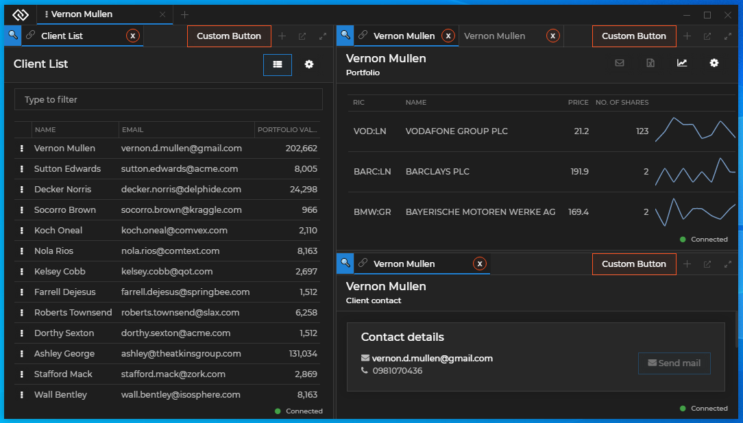
The following image demonstrates a Group Header with custom:
- Workspace Window Tab element containing a custom "Close" button;
- Group Header Buttons element containing a custom button;
- Before Tabs zone containing a custom icon;
To customize the Group Header elements and zones, use the groupHeader property of the components object in the <Workspaces /> component.
Workspace Window Tab
The following examples demonstrate creating a Workspace Window Tab component with customized "Close" button while keeping the default Channel Selector and title format.
When creating a custom "Close" button (or any custom element in the Workspace Window Tab that requires the user to click on it), you must consider preventing the "mousedown" and/or "click" events so that they won't be processed by the Workspaces framework. Otherwise, when the user holds down the mouse button on that element, the window tab will enter draggable mode.
Creating a custom "Close" button with the default closing functionality by using the respective prop:
import React, { useEffect, useRef } from "react";

const CustomCloseButton = ({ close }) => {
    const ref = useRef(null);

    useEffect(() => {
        if (!ref.current) { return };

        // Stop the propagation of the `"mousedown"` event,
        // in order to prevent the Workspaces framework from processing it.
        ref.current.onmousedown = e => e.stopPropagation();
    }, [ref]);

    return <button ref={ref} onClick={() => close()}>x</button>
};

export default CustomCloseButton;
Note that due to the nature of the Workspaces App and the fact that React event handlers are always executed after the native DOM event handlers, you must use a direct reference to the DOM elements instead of React events when handling the "mousedown" and "click" events.
Using the custom "Close" button in the Workspace Window Tab component. To preserve the default component functionalities, remember to pass the respective props to the components:
import React from "react";
import {
    WorkspaceWindowChannelsLink,
    WorkspaceWindowTabTitle,
    WorkspaceWindowTabCloseButton
} from "@glue42/workspaces-ui-react";
import CustomCloseButton from "./CustomCloseButton";

const CustomWorkspaceWindowTab = ({ channels, title, close }) => {
    return (
        <>
            {channels.visible && <WorkspaceWindowChannelsLink {...channels} />}
            <WorkspaceWindowTabTitle title={title} />
            {close.visible && <CustomCloseButton {...close} />}
        </>
    );
};

export default CustomWorkspaceWindowTab;
Using the custom Workspace Window Tab component in the Group Header element of your custom Workspaces App:
import React from "react";
import Workspaces from "@glue42/workspaces-ui-react";
import CustomWorkspaceWindowTab from "./CustomWorkspaceWindowTab";

const App = () => {
    return (
        <Workspaces
            components={{
                groupHeader: {
                    WorkspaceWindowTabComponent: CustomWorkspaceWindowTab
                }
            }}
        />
    );
};

export default App;
Group Header Buttons
The following example demonstrates creating a Group Header Buttons component containing a custom button and the standard tab window group buttons. To preserve the default component functionalities, remember to pass the respective props to the components:
import React from "react";
import {
    AddWindowButton,
    EjectButton,
    MaximizeGroupButton,
    RestoreGroupButton
} from "@glue42/workspaces-ui-react";

const CustomGroupHeaderButtons = ({ addWindow, eject, restore, maximize }) => {
    return (
        <>
            <button>Custom Button</button>
            {addWindow.visible && <AddWindowButton {...addWindow} />}
            {eject.visible && <EjectButton {...eject} />}
            {restore.visible && <RestoreGroupButton {...restore} />}
            {maximize.visible && <MaximizeGroupButton {...maximize} />}
        </>
    );
};

export default CustomGroupHeaderButtons;
Using the custom Group Header Buttons component in the Group Header element of your custom Workspaces App:
import React from "react";
import Workspaces from "@glue42/workspaces-ui-react";
import CustomWorkspaceWindowTab from "./CustomWorkspaceWindowTab";
import CustomGroupHeaderButtons from "./CustomGroupHeaderButtons";

const App = () => {
    return (
        <Workspaces
            components={{
                groupHeader: {
                    WorkspaceWindowTabComponent: CustomWorkspaceWindowTab,
                    ButtonsComponent: CustomGroupHeaderButtons
                }
            }}
        />
    );
};

export default App;
Zones
The following example demonstrates creating a custom component for the Before Tabs zone of the Group Header element:
import React from "react";
const CustomBeforeTab = () => {
return <div>🔍</div>
};
export default CustomBeforeTab;Using the custom component for the Before Tabs zone in the Group Header element of your custom Workspaces App:
import React from "react";
import Workspaces from "@glue42/workspaces-ui-react";
import CustomWorkspaceWindowTab from "./CustomWorkspaceWindowTab";
import CustomGroupHeaderButtons from "./CustomGroupHeaderButtons";
import CustomBeforeTab from "./CustomBeforeTab";

const App = () => {
    return (
        <Workspaces
            components={{
                groupHeader: {
                    WorkspaceWindowTabComponent: CustomWorkspaceWindowTab,
                    ButtonsComponent: CustomGroupHeaderButtons,
                    BeforeTabsComponent: CustomBeforeTab
                }
            }}
        />
    );
};

export default App;
Custom Popups
The library allows you to customize the system popups of the Workspaces App, as well as to create custom popups for your apps participating in the Workspace.
Using a custom button and a custom popup for the Add Workspace component:
Replacing the System Popups
The components prop of the <Workspaces /> component has a popups property that enables you to pass custom components or Glue42 apps that will act as system popups. To specify a custom Glue42 app as a system popup, pass its name as a string.
Note that if you decide to use the default system popups, you must ensure that they receive their required props. This includes a glue object with initialized Workspaces library and App Management library initialized in "full" or "skipIcons" mode.
The following example demonstrates how to pass default popup components and their props correctly and how to pass a custom Glue42 app as a popup:
import React from "react";
import Workspaces, {
    SaveWorkspacePopup,
    AddApplicationPopup
} from "@glue42/workspaces-ui-react";

const App = () => {
    return (
        <div className="App">
            <Workspaces
                components={{
                    popups: {
                        // Props are passed automatically.
                        SaveWorkspaceComponent: SaveWorkspacePopup,
                        // You must pass the props explicitly to the component and spread them.
                        AddApplicationComponent: props => <AddApplicationPopup {...props} />,
                        // Specifying a custom Glue42 app as a system popup.
                        AddWorkspaceComponent: "custom-add-workspace-popup"
                    }
                }}
            />
        </div>
    );
};

export default App;
Each system popup component receives several default props - functions for resizing and hiding the popup, as well as props for identifying the Frame, the Workspace or the Workspace element where the popup is located.
Save Workspace component:
| Prop | Signature | Description |
|---|---|---|
resizePopup |
(s: Size) => void |
Function for resizing the popup. Accepts a required Size object as a parameter with optional height and width properties. |
hidePopup |
() => void |
Function for hiding the popup. |
workspaceId |
string |
The ID of the Workspace that will be saved. |
glue |
any |
Optional. The Glue42 JavaScript library object. |
Add Workspace component:
| Prop | Signature | Description |
|---|---|---|
resizePopup |
(s: Size) => void |
Function for resizing the popup. Accepts a required Size object as a parameter with optional height and width properties. |
hidePopup |
() => void |
Function for hiding the popup. |
frameId |
string |
The ID of the Frame in which the Workspace will be created or loaded. |
glue |
any |
Optional. The Glue42 JavaScript library object. |
Add Application component:
| Prop | Signature | Description |
|---|---|---|
resizePopup |
(s: Size) => void |
Function for resizing the popup. Accepts a required Size object as a parameter with optional height and width properties. |
hidePopup |
() => void |
Function for hiding the popup. |
filterApps |
(app: Glue42.AppManager.Application) => bool |
Property expecting a user-defined predicate for filtering the apps that will be available in the "Add Application" popup menu. |
workspaceId |
string |
The ID of the Workspace in which the app will be added. |
boxId |
string |
The ID of the Workspace element in which the app will be added. |
glue |
any |
Optional. The Glue42 JavaScript library object. |
The following example demonstrates a reference implementation of a custom system popup component and how to handle resizing and hiding the popup:
import React, { useEffect } from "react";

const SaveWorkspacePopup = ({ resizePopup, hidePopup }) => {
    const containerRef = React.createRef();
    const refreshHeight = () => {
        if (!containerRef?.current) {
            return;
        }

        const bounds = containerRef.current.getBoundingClientRect();

        resizePopup({
            height: bounds.height,
            width: bounds.width
        });
    };

    useEffect(() => {
        refreshHeight();
    }, []);

    return (
        <div onClick={(e) =>e.stopPropagation()} ref={containerRef}>
            Custom Popup
            <button onClick={hidePopup}>Hide</button>
        </div>
    );
};

export default SaveWorkspacePopup;
The following example demonstrates how to use the default <AddApplicationPopup /> system popup and filter the apps that will be available in the "Add Application" menu by a custom user-defined property:
import React from "react";
import Workspaces { AddApplicationPopup } from "@glue42/workspaces-ui-react";
import "@glue42/workspaces-ui-react/dist/styles/popups.css";
import "@glue42/workspaces-ui-react/dist/styles/goldenlayout-base.css";
import "@glue42/workspaces-ui-react/dist/styles/glue42-theme.css";
import "./index.css";

const App = () => {
    // The custom properties from your app configuration are accessible through
    // the `userProperties` property of the `Application` object passed to the predicate function.
    const appFilter = app => app.userProperties.customAppFilterProperty;

    return (
        <Workspaces
            components={{
                popups:{
                    AddApplicationComponent: props => <AddApplicationPopup {...props} filterApps={appFilter} />
                }
            }}
        />
    );
};

export default App;
See the Limitations for using popups.
User Defined Popups
There are two ways for you to create custom popups from HTML elements - by using the <WorkspacePopup /> component, or by using the useWorkspacePopup() and useWorkspaceWindowClicked() hooks.
Note that the purpose of the <WorkspacePopup /> component and the useWorkspacePopup() hook is to ensure compatibility of the popups with Windows 7. If you don't need to support Windows 7, use only the useWorkspaceWindowClicked() hook to handle window clicks.
The <WorkspacePopup /> component is based on the popular reactjs-popup library. All features of the library are supported (see the Limitations for using popups) with the addition of two new properties:
| Property | Type | Description |
|---|---|---|
innerContentStyles |
object |
Value for the style property of the element that wraps the popup content. |
popupRef |
React.RefObject<PopupActions> |
Ref to the reactjs-popup popup element. |
The following example demonstrates how to create a custom popup using the <WorskpacePopup /> component:
import React from "react";
import { WorkspacePopup } from "@glue42/workspaces-ui-react";

const CustomPopup = ({ trigger }) => {
    const popupRef = React.createRef();

    return (
        <WorkspacePopup innerContentStyle={{ height:300 }} popupRef={popupRef} trigger={trigger}>
            <div style={{ backgroundColor:"blue", height:"100%" }}>
                Custom Popup
                <button onClick={() => popupRef.current?.close()}>Close</button>
            </div>
        </WorkspacePopup>
    );
};

export default CustomPopup;
The other way to create a popup is to implement a custom popup element and use the useWorkspacePopup() and/or useWorkspaceWindowClicked() hooks.
useWorkspacePopup()- accepts the ref object to the HTML element of the popup as a parameter and ensures compatibility of the popup with Windows 7. Returns an array of two functions - the first one is to manually notify Glue42 Enterprise that the popup has been resized and the second one is to manually notify Glue42 Enterprise that the popup has been hidden;
const popupRef = React.createRef();
const [popupResized, popupHidden] = useWorkspacePopup(popupRef);useWorkspaceWindowClicked()- accepts a callback that is invoked when a window in the Frame is focused. A genericonClickevent won't work for handling window clicks, because although the Workspaces App is a web app, it contains different apps from different processes. The hook returns an unsubscribe function, however, this unsubscribe function is called when the component is unmounted so implementing cleanup logic is usually unnecessary;
The following example demonstrates how to create a custom popup using the useWorkspacePopup() and useWorkspaceWindowClicked() hooks:
import React from "react";
import {
    useWorkspacePopup,
    useWorkspaceWindowClicked
} from "@glue42/workspaces-ui-react";

const CustomPopup = ({ closePopup }) => {
    const popupRef = React.createRef();

    useWorkspacePopup(popupRef);
    useWorkspaceWindowClicked(closePopup);

    return (
        <div ref={popupRef} style={popupStyle}>
            Custom Popup
            <button onClick={closePopup}>Close</button>
        </div>
    );
};

const popupStyle = {
    backgroundColor:"blue",
    height:100,
    position:"fixed",
    zIndex:99,
    top:100,
    left:100,
    width:100
};

export default CustomPopup;
See the Limitations for using popups.
Composing Workspace Content
The components prop of the <Workspaces /> component has a WorkspaceContents property that enables you to manipulate the content of a Workspace - hide or show the Workspace content or add custom elements to the Workspace. For instance, you may need to render the Workspace content conditionally.
Note that it isn't advisable to add complex components as additional Workspace content - the WorkspaceContents property is meant to allow you to add styling elements or interaction areas (simple toolbars, buttons, etc.) around the usual Workspace content.
The <WorkspaceContents /> component expects a Workspace ID as a prop.
Note that you must never render simultaneously components containing the same Workspace ID, as this will lead to unexpected behavior.
The following example demonstrates how to add a custom toolbar inside a Workspace and render it conditionally by clicking a custom button in the System Buttons element:
import React, { useState } from "react";
import Workspaces, { WorkspaceContents } from "@glue42/workspaces-ui-react";
import CustomWorkspaceContent from "./CustomWorkspaceContent";

const App = () => {
    const [showContent, setShowContent] = useState(true);

    return (
        <Workspaces
            components={{
                header: {
                    SystemButtonsComponent: () => <button onClick={() => setShowContent(!showContent)}>Toggle Toolbar</button>
                },
                WorkspaceContents: props => showContent ?
                    <WorkspaceContents {...props} /> :
                    <> <CustomWorkspaceContent workspaceId={props.workspaceId}/> <WorkspaceContents {...props}/> </>
            }}
        />
    );
};

export default App;
Adding a custom toolbar as part of the Workspace content:
For a demonstration of using the <WorkspaceContents /> component, see the Pinned Workspace Tabs example on GitHub. It shows how to render Workspace content conditionally using a button in the Workspaces App header.
Loading Animation
Available since Glue42 Enterprise 3.17
To replace the default loading animation for the Workspaces App, use the loadingAnimation property of the components object to provide your own custom component containing a loader:
import React from "react";
import Workspaces from "@glue42/workspaces-ui-react";
import MyCustomLoader from "./MyCustomLoader";

const App = () => {
    return (
        <div className="App">
            <Workspaces
                components={{
                    loadingAnimation: {
                        Workspace: MyCustomLoader
                    }
                }}
            />
        </div>
    );
};

export default App;
Note that you should consider a proper value for the Z-order of your custom loader, so that it won't be hidden behind other Workspace elements.
Requesting Focus
Some components in your custom Workspaces App may require keyboard focus when the user clicks on them (e.g., input fields) or when the component that contains them has been mounted. By default, the keyboard focus isn't on the Workspaces App (the web page itself), but rather on the apps participating in the Workspace. To move the keyboard focus to a component in the Workspaces App, use the requestFocus() method.
The following examples demonstrate how to move the keyboard focus to a custom input field located in a custom Workspace tab. The input field is used for changing the Workspace tab title - when the user double clicks on the tab, the input will be shown, and when they double click again, the new title will be set.
Create a custom input field and use the requestFocus() method to move the keyboard focus to it every time the component is mounted and when the user clicks on it. You must also use a direct reference to the element and stop the propagation of the "mousedown" and "click" events in order to prevent the Workspaces framework from processing them. Use the requestFocus() method in the "click" event in order to focus the element every time the user clicks on it, in case the element is already rendered, but loses focus, because the user has clicked somewhere else:
import React, { useState, useEffect, useRef } from "react";
import { requestFocus } from "@glue42/workspaces-ui-react";

const CustomInput = ({ setTabTitle }) => {
    const [newTitle, setNewTitle] = useState("");
    const ref = useRef(null);

    useEffect(() => {
        if (!ref.current) { return };

        // Stop the propagation of the `"mousedown"` and `"click"` events,
        // in order to prevent the Workspaces framework from processing them.
        ref.current.onmousedown = e => e.stopPropagation();
        ref.current.onclick = (e) => {
            e.stopPropagation();
            // Request keyboard focus when the component is mounted and the user clicks on it.
            requestFocus();
        };
    }, [ref]);

    return <input ref={ref} onDoubleClick={() => setTabTitle(newTitle)} onChange={e => {setNewTitle(e.target.value)}} value={newTitle} />;
};

export default CustomInput;
Note that due to the nature of the Workspaces App and the fact that React event handlers are always executed after the native DOM event handlers, you must use a direct reference to the DOM elements instead of React events when handling the "mousedown" and "click" events.
Note that you shouldn't use requestFocus() in the Workspace tab itself, but rather in an element it contains. If you use requestFocus() in the Workspace tab, you will have to prevent the propagation of the "click" and "mousedown" events there, which will prevent the Workspaces framework from processing them, leading to undesirable side effects - the user won't be able to move the Workspace tabs or even switch between them by clicking on them.
Compose a custom Workspace tab containing the custom input field that will render conditionally:
import React, { useState, useEffect } from "react";
import { WorkspaceSaveButton, WorkspaceTitle, WorkspaceTabCloseButton } from "@glue42/workspaces-ui-react";
import CustomInput from "./CustomInput";

const CustomWorkspaceTab = ({ title, onSaveClick, onCloseClick}) => {
    const [showInput, setShowInput] = useState(false);
    const [tabTitle, setTabTitle] = useState(title);

    useEffect(() => setTabTitle(title), [title]);

    return (
        <div onDoubleClick={() => setShowInput(!showInput)}>
            <WorkspaceSaveButton showSavePopup={onSaveClick} />
            {!showInput && <WorkspaceTitle title={tabTitle} />}
            {showInput && <CustomInput setTabTitle={setTabTitle} />}
            <WorkspaceTabCloseButton close={onCloseClick} />
        </div>
    );
};

export default CustomWorkspaceTab;
Replace the default <WorkspaceTab /> component with the custom one:
import React from "react";
import Workspaces from "@glue42/workspaces-ui-react";
import CustomWorkspaceTab from "./CustomWorkspaceTab";

const App = () => {
    return (
        <Workspaces
            components={{
                header: {
                    WorkspaceTabComponent: CustomWorkspaceTab
                }
            }}
        />
    );
};

export default App;
Styles
To use the default styles for your custom Workspaces App, import the following CSS files:
import "@glue42/workspaces-ui-react/dist/styles/popups.css";
import "@glue42/workspaces-ui-react/dist/styles/goldenlayout-base.css";
import "@glue42/workspaces-ui-react/dist/styles/glue42-theme.css";
To use custom styles for the Workspaces App, simply import your CSS file after the default CSS imports to override them. The goldenlayout-base.css file is mandatory, but you may skip the popup.css or glue42-theme.css imports if you don't want to use the default styles for the system popups or the default Glue42 themes. Two default themes are available - Day and Night - and the trigger for switching between them is the class property of the <html> element - "light" for the Day theme and "dark" for the Night theme:
<!-- Day theme -->
<html class="light">

<!-- Night theme -->
<html class="dark">
Limitations
You should consider the following technical limitations when using the @glue42/workspaces-ui-react library:
- Unless you set the
"rendererTransparencyMode"property in thestickywindows.jsonconfiguration file of Glue42 Enterprise to"Transparent"(usable on Windows 8+), any popups you may use must not have shadows or transparency. If"rendererTransparencyMode"is set to any other value, the shadow or the transparency will blend with the color specified in the"rendererTransparencyKeyColor"property which will result in an undesirable visual effect. Also, the color specified in"rendererTransparencyKeyColor"shouldn't be used individually or in a gradient, because it will always be rendered as transparent. For more details, see the Developers > Configuration > Glue42 Windows section. - To ensure full compatibility with Windows 7 and Windows 10, you must use the
<WorkspacePopup />component or theuseWorkspacePopup()anduseWorkspaceWindowClicked()hooks for your custom popups (except for any custom system popups where this is already handled internally). - The Frame doesn't have a Glue42 Window object (
glue.windows.my()returnsundefined) and thegetMyFrame()method can't be used in the Frame (see Using Glue42 APIs in the Frame). - Refs to the custom components passed to the
<Workspaces />component shouldn't be used in any parent component of<Workspaces />because the children of<Workspaces />aren't immediately rendered and therefore these refs won't work as expected.