Notifications
Overview
Notifications represent events important enough to be brought to the attention of the user. Some examples are:
- an alert from an app for an automatic machine restart, or from a metrics monitoring tool for a system running hot;
- a trade order execution notification from an Order Management System;
- a workflow task assigned to a user or a group of users that can optionally need a response - e.g., a change of client address;
- an activity that is forwarded or re-assigned to a user - e.g., handling a client call;
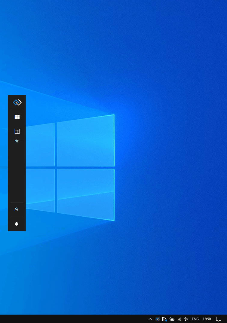
Glue42 Enterprise provides a notifications service that normalizes and consolidates notifications from different apps and delivers them directly to the user on the desktop in a customizable UI as both toasts and ordered lists in a Notification Panel:
The notification toasts and the Notification Panel are configurable and completely customizable system apps.
Glue42 enabled apps can use the Glue42 Notification APIs to raise notifications at runtime.
Using Notifications
Glue42 Enterprise shows notifications on the desktop using notification toasts and a Notification Panel.
Notification Toasts
Notifications can be shown on the desktop as notification toasts. You can close them manually or interact directly with them by clicking on the notification or on an action button in it. Toasts expire based on configuration and hide automatically after the specified time has elapsed:
Available since Glue42 Enterprise 3.21
Notification toasts can be configured from the "Settings" menu of the Notification Panel to group automatically in stacks by app or by severity. This improves the user experience and saves space on the screen. When you hover over a notification stack, it expands and displays all notification toasts in it. You can then interact with the notifications in it, clear the entire stack, or let it collapse by moving the mouse away from it:
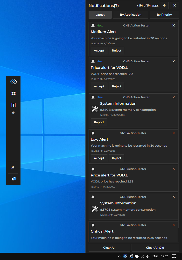
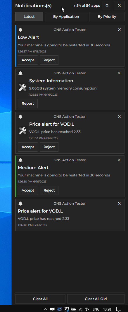
Notification Panel
The Notification Panel is accessible through the Glue42 Floating Toolbar or the Glue42 Launchpad and contains all received notifications that haven't been closed or acknowledged by the user. Notifications in it can be grouped by priority, by the apps that have published them, or by timestamp. You can close notifications individually or interact with them by clicking on the notification or on an action button in it. Notifications that you haven't seen yet by opening the Notification Panel are marked as "New". You can use the "Clear All" or "Clear All Old" buttons to clear all notifications or all already seen notifications respectively from the Notification Panel:
Notification Settings
Available since Glue42 Enterprise 3.21
The Notification Panel has a "Settings" button that opens a menu with notification settings. You can use it to enable or disable notifications globally or per app, and to configure notification toast stacking:
After selecting the desired settings, click the "Save Changes" button or the "Settings" button again to save your changes. To revert the changes, click the "Discard Changes" button or close the Notification Panel.
The "General Settings" section has the following settings:
| Setting | Description |
|---|---|
| Allow Notifications | Enable or disable all notifications. |
| Auto Hide Panel | Whether to hide the Notification Panel automatically when it loses focus. If disabled, the Notification Panel will remain visible until the user closes it manually. |
| Toast Stacking | Whether to group notification toasts in stacks. You have options for grouping the notification toasts by app or by severity. |
The "Allowed Notifications" section offers a finer control over from which apps to receive notifications:
| Setting | Description |
|---|---|
| All Applications | Enable or disable receiving notifications from all applications. |
| App List | All items after the "All Applications" setting are names of individual Glue42 apps for which you can enable or disable notifications. |
Configuration
By default, notifications are enabled in Glue42 Enterprise. To specify global notification settings, use the "notifications" top-level key of the system.json system configuration file located in the %LocalAppData%\Tick42\GlueDesktop\config folder.
The "notifications" object has the following properties:
| Property | Type | Description |
|---|---|---|
"enabled" |
boolean |
If true, will enable all notifications - notification toasts and notifications in the Notification Panel. |
"enableToasts" |
boolean |
If true, will enable notification toasts. |
"sourceFilter" |
object |
Filter with names of apps that are allowed or not allowed to raise notifications. |
"toastExpiry" |
number |
Interval in milliseconds after which the notification toasts will be hidden. |
The "sourceFilter" object has the following properties:
| Property | Type | Description |
|---|---|---|
"allowed" |
string[] |
Names of apps allowed to raise notifications. |
"blocked" |
string[] |
Names of apps not allowed to raise notifications. |
The following example demonstrates the default global notification settings:
{
    "notifications": {
        "enabled": true,
        "enableToasts": true,
        "sourceFilter": {
            "allowed": ["*"]
        },
        "toastExpiry": 15000
    }
}
Extending Notifications
Available since Glue42 Enterprise 3.17
The @glue42/notifications-ui-react library enables you to create your own Notifications App for Glue42 Enterprise. The library provides hooks and default components which you can use to build your own Notifications App by using, modifying or replacing the available components and functionalities.
To use the library in your project, execute the following command:
npm install @glue42/notifications-ui-reactNote that the @glue42/notifications-ui-react library doesn't include a built Notifications App. A Notifications App is provided in Glue42 Enterprise. You can also use and customize the Notifications App template.
Configuration
To use your custom Notifications App built with the @glue42/notifications-ui-react library, modify the notifications.json app configuration file located in %LocalAppData%\Tick42\GlueDesktop\config\apps. Set the "url" property of the "details" top-level key to the URL of your custom Notifications App:
{
    "details": {
        "url": "http://localhost:3000"
    }
}
To change the location of the Notification Panel on the screen, use the "placement" property of the "details" top-level key in the app configuration file. The following example demonstrates how to place the Notification Panel on the left of the screen and change its width in pixels:
{
    "details": {
        "placement": {
            // Make the Notification Panel preserve its specific position in case of screen resolution changes.
            "snapped": true,
            // Place the Notification Panel on the left of the screen.
            "horizontalAlignment": "left",
            // Stretch the Notification Panel to occupy the entire screen height.
            "verticalAlignment": "stretch",
            // Change the Notification Panel width.
            "width": 350
        }
    }
}
For more details on Glue42 Window placement, see the Developers > Configuration > Application > Placement section.
Hooks
The useNotificationsContext() hook provides context information about the Notifications App and the available notifications, as well as methods for the default notification functionalities which you can use directly in your custom components:
const {
    allApplications,
    allApps,
    allowedApplications,
    clearAll,
    clearAllOld,
    configuration,
    hidePanel,
    hideSettingsPanel,
    isPanelVisible,
    isSettingsVisible,
    notifications,
    notificationStack,
    saveFilter,
    saveSettings,
    setAutoHidePanel,
    setHideOnClose,
    settings,
    showPanel,
    showSettingsPanel,
    sortBy
} = useNotificationsContext();| Property | Type | Description |
|---|---|---|
allApplications |
number |
The number of all available Glue42 apps. |
allApps |
object[] |
Array of objects describing all available Glue42 apps. Each object has title, name and allowed properties. The allowed property holds a Boolean value specifying whether the app is allowed to raise notifications. |
allowedApplications |
number |
The number of Glue42 apps allowed to raise notifications. |
clearAll() |
function |
Clears all notifications from the Notification Panel. |
clearAllOld() |
function |
Clears all notifications that have already been seen by the user in the Notification Panel. |
configuration |
object |
Object with configuration for the Glue42 Notifications. |
hidePanel() |
function |
Hides the Notification Panel. |
hideSettingsPanel() |
function |
Hides the "Settings" section in the Notification Panel. |
isPanelVisible |
boolean |
Whether the Notification Panel is currently visible. |
isSettingsVisible |
boolean |
Whether the "Settings" section in the Notification Panel is currently visible. |
notifications |
object[] |
A list of all available notification objects. |
notificationStack |
object[] |
A list of all available notification stacks. Each notification stack object has key and items properties. The key property holds a string value which is either the name of the app which has raised the notifications in the stack, or the notification severity, depending on the criteria by which the notifications are grouped in stacks. The items property holds an array of all notification objects in the stack. |
saveFilter() |
function |
Accepts an array of objects as an argument, each object describing a Glue42 app (same object structure as the objects in the allApps array). This array is used as a filter for determining which app is allowed to raise notifications. |
saveSettings() |
function |
Accepts as an argument an object describing the updated notification settings (same object structure as the object in the settings property). Saves the current notification settings. |
setAutoHidePanel() |
function |
Accepts a Boolean value as an argument and specifies whether the Notification Panel should hide automatically when it loses focus. |
setHideOnClose() |
function |
Accepts a Boolean value as an argument and specifies whether the Notification Panel should be hidden or closed when the user presses ALT + F4. |
settings |
object |
Object describing the current notification settings (see below). |
showPanel() |
function |
Shows the Notification Panel. |
showSettingsPanel() |
function |
Shows the "Settings" section in the Notification Panel. |
sortBy() |
function |
Sorts the notifications in the Notification Panel. Accepts a string value as an argument. Pass "timestamp" to show the latest notifications, "priority" to sort notification by priority, or "application" to sort the notifications by the name of the app that has raised them. |
The settings object has the following properties:
| Property | Type | Description |
|---|---|---|
alwaysOnTop |
boolean |
Whether the Notification Panel should always be on top. |
autoHidePanel |
boolean |
Whether the Notification Panel should hide automatically when it loses focus. |
enabledNotifications |
boolean |
Whether notifications are enabled or disabled globally. |
stackBy |
"application" | "severity" |
Whether the notifications are to be stacked by the app that has raised them, or by severity. |
toastStacking |
boolean |
Whether grouping notifications in stacks is enabled or disabled. |
Components
All default components can be reused and composed with custom code. If usage of such component has been detected, its default behavior will be applied. For instance, if you use the <PanelFooterClearAllButton /> component, it will automatically clear all notifications when the button is clicked, without the need of custom code to induce this behavior. If you pass the same component more than once, an error will be thrown.
To remove a component, pass a <Fragment /> component. If you want to use a default functionality (e.g., for clearing or sorting notifications) in your custom components, use the useNotificationsContext() hook to acquire it and pass it to your component.
In your custom Notifications App, you should place the <Panel /> and <Toasts /> components in the <NotificationsProvider /> component. This component is a React context provider component that provides notification-related data and functionality accessible through the useNotificationsContext() hook. The <NotificationsProvider /> component should contain a <NotificationsWrapper /> component whose purpose is to render either the <Panel /> or the <Toasts /> component when a notification is received, based on whether the Notification Panel is currently visible or not. If, for instance, you don't want to use notification toasts, you can place your customized <Panel /> component directly under the <NotificationsProvider /> component.
The following example demonstrates a basic usage of the library:
import React from "react";
import {
    NotificationsProvider,
    useNotificationsContext
} from "@glue42/notifications-ui-react";
import CustomPanel from "./CustomPanel";
import CustomToasts from "./CustomToasts";

// Create a wrapper component that will render either the Notification Panel or
// the toasts wrapper when a notification is received based on whether the panel is visible.
const NotificationsWrapper = () => {
    const { isPanelVisible } = useNotificationsContext();

    return isPanelVisible ? <CustomPanel /> : <CustomToasts />;
};

const App = () => {
    return (
        <NotificationsProvider>
            <NotificationsWrapper />
        </NotificationsProvider>
    );
};

export default App;
Notification Panel
The <Panel /> component is used for rendering the Notification Panel. The following example demonstrates the structure of the <Panel /> component, its properties and default values:
<Panel
hideOnFocusLost={true}
// Available since Glue42 Enterprise 3.18.
hideOnClose={true}
components={{
NotificationsList: NotificationsList,
Notification: Notification,
Header: () => {
return (
<>
<HeaderCaption />
<HeaderSortButtons />
</>
);
},
HeaderCaption: () => {
return (
<div>
<HeaderCaptionTitle />
<HeaderCaptionFilter />
<HeaderCaptionButtons />
</div>
);
},
HeaderCaptionButtons: () => {
return (
<ButtonGroup>
<HeaderCaptionButtonSettings />
<HeaderCaptionButtonClose />
</ButtonGroup>
);
},
HeaderCaptionButtonClose: HeaderCaptionButtonClose,
HeaderCaptionButtonSettings: HeaderCaptionButtonSettings,
HeaderCaptionFilter: HeaderCaptionFilter,
HeaderCaptionTitle: HeaderCaptionTitle,
HeaderSortButtons: () => {
return (
<ButtonGroup>
<HeaderSortButtonsTimestamp />
<HeaderSortButtonsApplication />
<HeaderSortButtonsPriority />
</ButtonGroup>
);
},
HeaderSortButtonsApplication: HeaderSortButtonsApplication,
HeaderSortButtonsPriority: HeaderSortButtonsPriority,
HeaderSortButtonsTimestamp: HeaderSortButtonsTimestamp,
Body: () => {
return (
<div>
<NotificationsList />
</div>
);
},
Footer: () => {
return (
<div>
<FooterButtons />
</div>
);
},
FooterButtons: () => {
return (
<ButtonGroup>
<FooterButtonsClearAll />
<FooterButtonsClearAllOld />
</ButtonGroup>
);
},
FooterButtonsClearAll: FooterButtonsClearAll,
FooterButtonsClearAllOld: FooterButtonsClearAllOld,
PanelSettings: () => {
return (
<Modal>
<Block title="General Settings">
<div>
<Switch label="Allow Notifications" />
</div>
<div>
<Switch label="Auto Hide Panel" />
</div>
<div>
<Switch label="Toast Stacking" />
</div>
<div>
<Radio label="Stack by Application" />
<Radio label="Stack by Severity" />
</div>
</Block>
<Block title="Allowed Notifications">
<div>
<Switch label="All Applications" />
</div>
{apps.map((app) => (
// All available Glue42 apps.
<div>
<Switch label={app.title ?? app.name} />
</div>
))}
</Block>
</Modal>
);
},
Modal: Modal,
Block: Block,
Switch: Switch,
Radio: Radio
}}
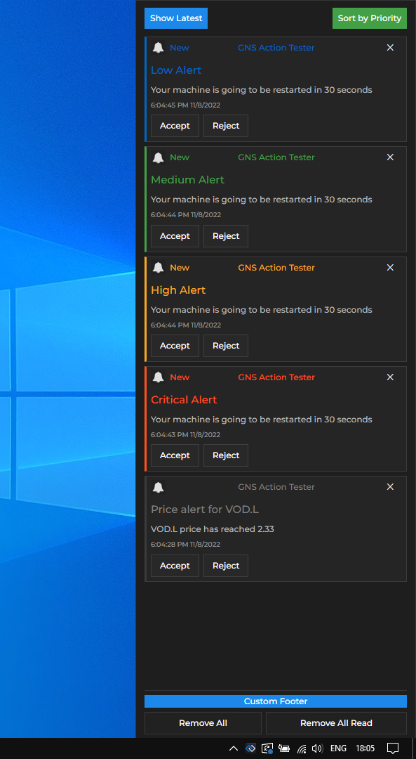
/>The following example demonstrates creating a custom Notification Panel with custom header, footer and custom text on the buttons for clearing notifications. The header contains two custom buttons for sorting notifications that use the default functionality for sorting by timestamp and by priority:
import {
    useNotificationsContext
    Panel,
    PanelFooterButtons,
    PanelFooterClearAllButton,
    PanelFooterClearAllOldButton
} from "@glue42/notifications-ui-react";

// Get the default method for sorting notifications.
const { sortBy } = useNotificationsContext();

// Custom header for the Notification Panel containing
// custom buttons with default sorting functionality.
const CustomPanelHeader = () => {
    return (
        <div>
            <button onClick={() => sortBy("timestamp")}>Show Latest</button>
            <button onClick={() => sortBy("priority")}>Sort by Priority</button>
        </div>
    );
};

// Custom footer for the Notification Panel.
const CustomPanelFooter = ({ className, ...rest }) => {
    return (
        <div className={className} {...rest}>
            <div>Custom Footer</div>
            <PanelFooterButtons />
        </div>
    );
};

const CustomPanel = () => {
    return (
        <Panel
            // The Notification Panel will remain visible when it loses focus.
            hideOnFocusLost={false}
            components={{
                Header: CustomPanelHeader,
                // Providing a custom class for the footer.
                Footer: props => <CustomPanelFooter className={"my-custom-class"} {...props}/>,
                // Providing custom text for the Notification Panel footer buttons.
                FooterButtonsClearAll: () => <PanelFooterClearAllButton text="Remove All" />,
                FooterButtonsClearAllOld: () => <PanelFooterClearAllOldButton text="Remove All Read" />
            }}
        />
    );
};

export default CustomPanel;
Available since Glue42 Enterprise 3.18
By default, the Notification Panel app will only be hidden when the user tries to close it. If you want the Notification Panel app to close instead of hide, set the hideOnClose property to false:
const CustomPanel = () => {
    return <Panel hideOnClose={false} />
};

export default CustomPanel;
Toasts Wrapper
The <Toasts /> component is used for rendering the toasts wrapper which shows one or more notification toasts when the Notification Panel is closed. The following example demonstrates the structure of the <Toasts /> component, its properties and default values:
<Toasts
    maxToasts={10}

    components={{
        NotificationsList: NotificationsList,
        Notification: Notification,
        Header: () => <></>,
        Body: () => {
            return (
                <div>
                    <NotificationsList />
                </div>
            );
        },
        Footer: () => <></>
    }}
/>
The following example demonstrates creating a custom toasts wrapper containing a custom header and footer. The toasts wrapper will contain a maximum of three notifications at a time and will appear at the top of the screen, instead of at its default location at the bottom of the screen. The functionality for getting a list of the active notifications (the ones for which the time limit set in the "toastExpiry" notification configuration property hasn't elapsed yet) and limiting it up to the number specified in the maxToasts property is taken directly from the default <Body /> component, part of the <ToastsWrapper /> component, provided by the library:
import { useEffect, useState } from "react";
import { Toasts, Notification, NotificationsList } from "@glue42/notifications-ui-react";

const CustomToastsBody = ({ className, notifications, maxToasts, ...rest }) => {

    const [activeNotifications, setActiveNotifications] = useState([]);

    // Getting the active notifications and limiting the list of notification toasts
    // displayed in the toasts wrapper up to the number specified in the `maxToasts` property.
    useEffect(() => {
        const active = notifications?.filter(n => n.state === "Active").slice(0, maxToasts);

        setActiveNotifications(active);
    }, [notifications]);

    return (
        // Use the `"toast-top"` class to make the toasts wrapper appear at the top of the screen.
        <div className={`toast-top ${className}`} {...rest}>
            <NotificationsList
                Notification= {Notification}
                notifications={activeNotifications}
                noNotificationText=""
            />
        </div>
    );
};

const CustomToasts = () => {
    return (
        <Toasts
            // Specifying the number of notifications that can appear in the toasts wrapper.
            maxToasts={3}
            components={{
                Header: () => <div>Custom Header</div>,
                // Passing a custom class.
                Body: props => <CustomToastsBody className={"my-custom-class"} {...props} />,
                Footer: () => <div>Custom Footer</div>
            }}
        />
    );
};

export default CustomToasts;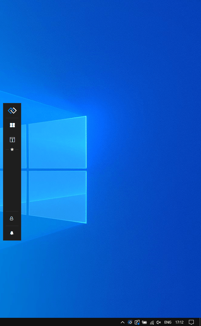
Available since Glue42 Enterprise 3.18
If you want the toasts wrapper to adjust dynamically and display all currently active notifications, instead of limiting their number, pass a negative value to the maxToasts property:
const CustomToasts = () => {
    return <Toasts maxToasts={-1} />
};

export default CustomToasts;
Notification
The <Notification /> component is used for rendering the notification itself. The following example demonstrates the structure of the <Notification /> component, its properties and default values:
<Notification
    notification={Glue42Notification}

    components={{
        Body: () => {
            return (
                <div>
                    <BodyIcon />
                    <div>
                        <BodyTitle />
                        <BodyDescription />
                        <BodyTimestamp />
                    </div>
                </div>
            );
        },
        BodyDescription: BodyDescription,
        BodyIcon: BodyIcon,
        BodyTimestamp: BodyTimestamp,
        BodyTitle: BodyTitle,
        Footer: () => {
            return (
                <div>
                    <ButtonGroup>
                        {notification.actions?.map(action => <FooterButton />)}
                    </ButtonGroup>
                </div>
            );
        },
        FooterButton: FooterButton,
        Header: () => {
            return (
                 <div>
                    <HeaderBadge />
                    <HeaderIcon />
                    <HeaderTitle />
                    <HeaderButton />
                </div>
            );
        },
        HeaderBadge: HeaderBadge,
        HeaderButton: HeaderButton,
        HeaderIcon: HeaderIcon,
        HeaderTitle: HeaderTitle,
        NotificationStack: NotificationStack
    }}
/>
The following example demonstrates creating a custom notification for the Notification Panel that has a customized header and body titles. The color of the notification titles will change depending on the severity of the received notification:
import { Panel, Notification } from "@glue42/notifications-ui-react";

const CustomNotification = ({ notification }) => {
    const { severity, appTitle, title } = notification;
    let textColor;

    // Assign a color value according to the notification severity.
    switch (severity) {
        case "Low": textColor = "#0066c0";
            break;
        case "Medium": textColor = "#43a047";
            break;
        case "High": textColor = "#f9a825";
            break;
        case "Critical": textColor = "#ff511f";
            break;
        default: textColor = "grey"
    };

    return (
        <Notification
            notification={notification}
            components={{
                HeaderTitle: () => <div style={{color: textColor}}>{appTitle}</div>,
                BodyTitle: () => <h1 style={{color: textColor}}> {title}</h1>
            }}
        />
    );
};

const CustomPanel = () => {
    return (
        <Panel
            components={{
                Notification: CustomNotification
            }}
        />
    );
};

export default CustomPanel;